One of the most important benefits of SharePoint Online is that it contains well-designed tools for shared creation of documents within teams and projects. If it is mandatory to be able to open Office documents directly from the intranet and for multiple users to edit them simultaneously, scale is often tipped towards SharePoint right from the beginning when selecting the most suitable technology for a new intranet implementation.But when intranet usability on a mobile device is taken into consideration, the choice is not so obvious anymore. Yes, SharePoint Online is available as a cloud service from outside the organization’s own network, but SharePoint’s proprietary page templates and themes are not responsive, and using sites designed for desktop screens is far from inviting on a mobile device. What are the remedies, then?
North Patrol is a consulting firm specialized in the design of digital services and information systems. We shape ideas into a vision and service concept, find the best architectural and technological solutions, design a functional user experience, and compete to find the ideal partner for implementation work. We do not sell implementation projects, nor do we sell licenses; we are genuinely on the side of the customer.

6 February 2017
There are at least four different approaches:
- Using SharePoint’s own mobile views
- Using Microsoft Office mobile apps
- Editing SharePoint page and site templates
- Editing page appearance with javascript
The first two approaches are the easiest ones. They don’t necessarily require any custom application code or other wizardry performed by the technical vendor. On the other hand, they also offer the least opportunities for customizing the site according to the client’s requirements. The two latter alternatives enable more customization, but most often the technical implementation has to be purchased from a vendor.
So let’s take a closer look at the alternatives.
1. SharePoint mobile views
For a long time already, SharePoint has been able to create mobile-friendly versions of sites which enable navigation to document libraries, subsites, and individual pages. It is a shame however that the visual appearance is dreary and the usability is awkward at best, which means this approach can hardly be recommended to anyone.
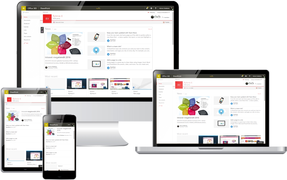
The new kind of responsive – often even called modern – page templates are a step into the right direction. A new team site can now be created utilizing modern layout and design, and even the home page of sites created with the old templates can be modernized relatively easily. One can stack modern elements such as web parts on top of each other, and SharePoint is able to scale the page neatly depending on the browsing device (see featured image below).
These so-called modern pages are still something new, which means that usage potential is somewhat limited at least for the time being. Modernness is not inherited (at least yet), meaning that subsites will still use traditional, nonresponsive templates as default. One cannot add traditional web parts into modern pages or use customized templates. For instance, the often seen three-column layout with related information displayed on the right cannot be created using a modern page template. Overall, customization is limited to modifying the color scheme only – at least for now.
However, there are already a dozen of content elements which can be used to add formatted text, images, video clips, document lists or e.g. a Yammer feed onto the page. This means that the simplest basic needs can be met relatively well already.
2. Mobile apps
Mobile apps offer very viable solutions as well, at least for the most basic requirements. Mobile apps for different platforms are already available for SharePoint, Delve, OneDrive, Groups, Office tools etc. For instance, the SharePoint app allows the user to connect to most often used and/or followed sites and documents saved from them. That’s convenient.
The downside of these apps is that they are designed for a limited set of use cases. For example, the SharePoint-app is mostly intended for editing documents. It doesn’t show web/app parts possibly added to the browser UI.
Outlook Groups mobile app is clearly designed for tackling the problematics of a limited set of use cases. Therefore, it gathers team conversations, files, OneNote notebook and calendar under the same umbrella. Customized web parts cannot be displayed here either, and at least I’m confused why team conversations are done via Outlook’s group mailboxes instead of Yammer. I bet many would like to be able to see content pages published on team sites (e.g. team news feed) as well.
Groups is a bit confusing but interesting entity, which will most certainly develop over time. And I’m sure it has its own user base already.
3. Editing SharePoint site and page templates
In order to be able to offer a consistent user experience both on desktop and mobile devices, the whole site must be responsive. The traditional and most straightforward method is to create customized master pages and page templates, so that the same responsive user experience is reproduced on every page. However, I would advise to avoid this approach. Microsoft updates their Office 365 applications regularly. In case Microsoft alters the master pages, the old versions will be replaced without requesting confirmation. Worst case scenario is that the site will be a mess after an update, until the changes are migrated to the new templates.
Despite this, many vendors still offer this method to provide responsive content. From the vendor’s point of view it is certainly convenient that the system administrators can keep themselves busy at regular intervals. In situations like this, you might want to stay alert and suggest that maybe it could be done in a way that would not require modifying the master pages. One such method is presented in the following chapter.
4. Editing page appearance with javascript
Currently the most efficient method is creating intranet pages using traditional, nonresponsive page templates, and to add customized javascript and style definition files onto the site. They will instruct the user’s browser to make the necessary layout changes when displaying the content (this is called “javascript injection”). Javascript files and style sheets can be added onto the site without modifying the master pages. This way the risk of Microsoft’s updates messing up the pages is dramatically reduced.
The risk is not entirely gone, however, because the style sheets must redefine some of the basic styles used by Microsoft. If Microsoft decides to change the naming conventions of their styles, the results may be… surprising. This is not very likely however, so this approach is much better than the aforementioned method of editing master pages.
This solution takes more time to implement than the others. It requires in-depth knowledge of the SharePoint environment, as well as solid experience in creating page layouts by using style sheets and javascript. Moreover, making responsive page templates is not all you need to do, since also the web parts and their content must scale nicely on mobile devices. Sometimes reaching this goal may require quite a bit of elbow grease. This is when you want to ask the vendor for references of their previous implementations.
The clients can consider themselves lucky since many SharePoint vendors have created solutions based on this model for quite some time already. Many vendors have bundled their solutions into products or standard implementation models. This means that a lot of code snippets can be reused and errors are less likely when one does not have to do everything from scratch every time. This can also be seen in the pricing of Office 365 intranet projects, as the amount of programming and customizations can be minimized and the focus is more on enabling smooth mobile use and achieving a pleasant visual concept.
How to choose wisely
Choosing the right path to follow always depends on the actual needs of the intranet users. If these needs cannot be met with the standard set of tools – such as Office tools, simple team pages and Yammer – you still do not have to reach for the stars. It does not take a very specialized set of technical skills to implement standard mobile views and apps, and with expert guidance one is able to do a lot with them.
If the scale of the intranet implementation is vast, or there is some other reason why standard solutions will not work well, the best way to create responsive content at the moment is by customizing content with javascript. The approach has its own downsides, and without a doubt there will be a time when modern page templates have reached the point in their evolution that it is worthwhile to build the whole site based on them. That time is yet to come. While we are holding our breath, javascript injection is the most solid method.
Regardless of the path you choose, you should allocate enough time for planning the creation and implementation phases. This way your intranet will not end up being a steaming pile where no one ever finds anything.